Wow. Where to begin! After two full, fabulous days at market, my feet are tired, my mind exhausted and I'm a bit overwhelmed. As I want to capture the essence of my findings, I will push my weary mind to put my thoughts in writing now, and resist the urge to delay or over-edit.
The world of interiors and architecture has been teasing my mind and lapping at my heals since I was twelve. That was the year my grandmother's friend up the street, Mrs. Hein, started passing her copies of Architectural Digest to me after she finished reading them. I read them cover to cover every month, stock-piled them in my room, and have ever since. My only regret, is that with each major change or move in my life, my purging required dumping years worth of the archived magazines in the dumpster. Alas...
Market afforded me the opportunity to see first hand the latest trends in the interiors industry, to sit on dozens and dozens of sofas, chairs and ottomans, and investigate developments in sustainable products and technologies. I was surprised and pleased to find much of the best in textile development and furniture manufacturing still happens here in the USA. Many of these companies are here in North Carolina where textile mills originated, hence Highpoint is still the furniture capital of the country.
What's trending? Here is a quick primer...
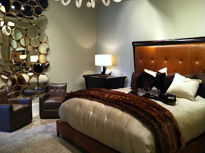
Faux furs and hides, draped over sofas and beds, as upholstering, and on the floor...


Furniture upholstered in fun ways, often piecing together numerous fabrics on one piece, and taking a classic, antique, salvaged or reproduction chairs and either descontructing them to the bare bones and muslin (restoration hardware style), or reupholstering them in unexpected ways...
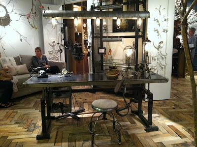
The industrial look is still strong, and you see it everywhere, in tables and chairs, lighting and accessories. I love the juxtaposition of the cold, hard edges of steel and alongside the organic warmth of wood construction and hand craftsmanship. Our own David Zimmerman has been in demand of late, and I can't seem to keep enough of his work on the floor.
 My personal favorites? Phillips Collection, above, and the fabulous, brilliantly executed, playful take on classic furniture styles by Christopher Guy. A change in perspective or proportion is balanced with the essence of restraint and a healthy dose of imagination and wit. Love it!
I adore the depth of color in Lillian August for Hickory White. Deep, fun color on the walls, rich, textured upholstery on equisitely comfortable furniture, and art! Big, bold paintings, stacked collections of etchings and sculptures completed each space.
Baker was among my more memorable stops, with a new collection by Thomas Pheasant taking center stage. This designer has the gift of grace and restraint in his reinterpretations of classical line and proportions.
The perfect transitional collection, (sorry, no pics allowed in the showroom), you'll have to watch for it online, in your favorite high-end furniture store, or surely in upcoming issues of Architectural Digest.
My absolute, hands-down favorite showroom was Luna Bella. More than accessories for sure, but the jewel in their crown is the lighting. This is the one to watch!


